Vitassist
UX Research, flow, use cases, wireframing and prototyping
I was hired to create the packaging design for a new supplement brand called VitAssist. The client wanted a design that communicated the brand's core values of health, wellness, and natural ingredients. The design should also stand out on the shelves and appeal to a broad range of consumers.
Research and Analysis
To understand the target audience and the market, I conducted market research and analyzed the packaging designs of other supplement brands. I also gathered feedback from potential customers through surveys and focus groups to understand their preferences and pain points when it comes to supplement packaging.
Design and Iteration
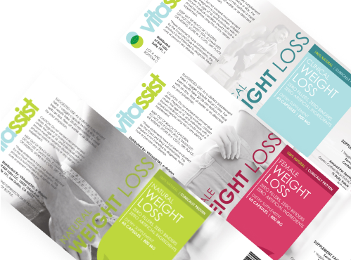
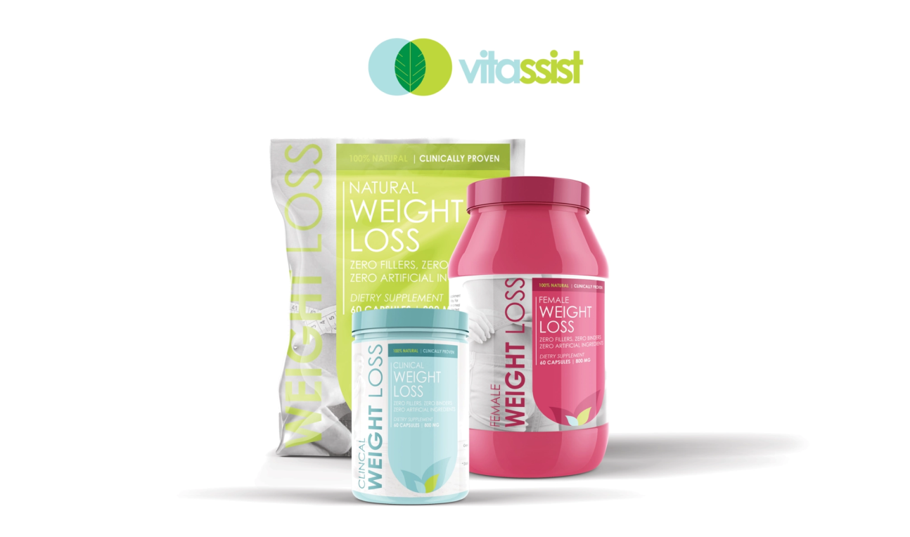
Based on the research insights, I began the design process. I created several design concepts that reflected the brand's values and the preferences of the target audience. I used a minimalist approach with a focus on clean lines and bright, natural colors to create a design that stood out on the shelves. I also incorporated custom illustrations of natural ingredients to communicate the brand's commitment to natural ingredients.
After presenting the initial design concepts to the client, we selected one concept to move forward with. I then made iterative changes to the design to improve its overall appeal and functionality. I added a QR code on the back of the packaging that allowed customers to access information about the ingredients, recommended dosage, and the brand's quality control practices.
Final Product
The final product was a packaging design that communicated the brand's values and appealed to the target audience. The clean design, natural colors, and custom illustrations created a design that stood out on the shelves. The QR code added functionality and made it easier for customers to access important information about the supplement's ingredients and usage. The client was pleased with the final design and reported positive feedback from customers.


 Back to gallery


